With the onset of a pandemic, itinerant ministry came to a screeching halt. No in-person gatherings meant motivational speakers had no live audience.
Igniting Hope Ministries pivoted by taking its life-changing messages to the cyberspace.
Hello, class in the comfort of your home.
role
product design
Content design
Photography
the challenge
Igniting Hope Academy (IHA)’s website needed a refresher. It was disconnected from brand identity, and could better direct users to relevant course information.
I owned end-to-end design, including content design, collaborating with a cross-functional team of PM, developers, film crew, and stakeholders.
A fresh face for the new frontier
Igniting Hope Academy (IHA)’s website needed a refresher. It was disconnected from brand identity, and could better direct users to relevant course information.
I owned end-to-end design, including content design, collaborating with a cross-functional team of PM, developers, film crew, and stakeholders.
Research takeaways
Usability testing
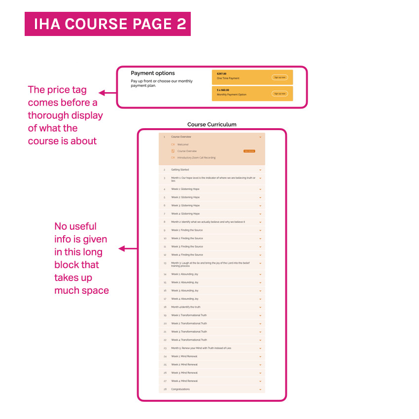
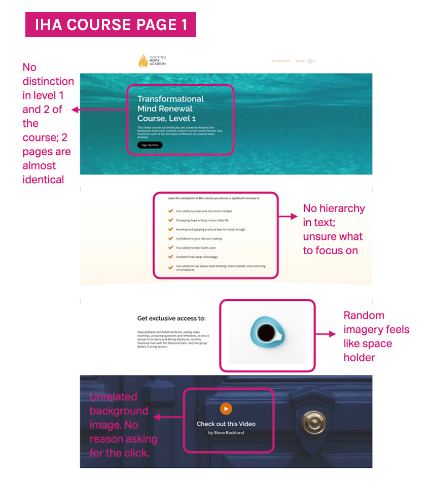
Studies done on the original site revealed users were left confused all around: what courses are available, what does each class offer, how does sign up work?
Audit
The flow of the site didn’t make sense to the user. Course pages lacked crucial details.
User interviews & surveys
“The site can’t pass as a branch of the ministry. It’s like the younger brother trying to look good in your clothes.”
“So what will I learn in this class?”
“I don’t get how this course is different from the other one.”
strategy
I can do this!


ART DIRECTION
The new platform called for a visual identity representing Igniting Hope Ministries and the joy and exuberance it sparks.
I kept a familiar feel by incorporating a palette reminiscient of Igniting Hope’s yellow brand color.
Cue inspirational photography, encouraging voice, and clean design enveloping the user in a “I got this!” feeling.
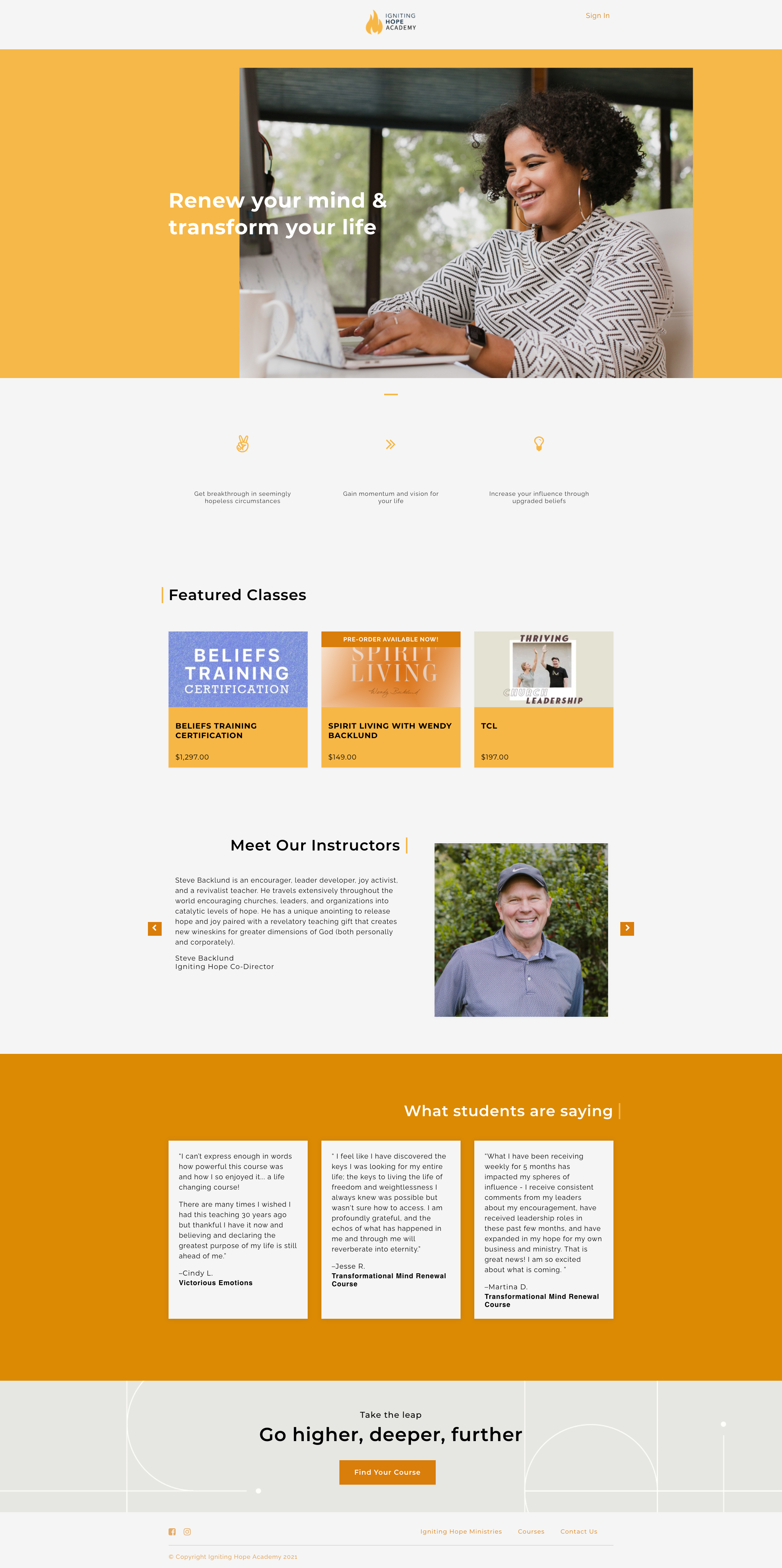
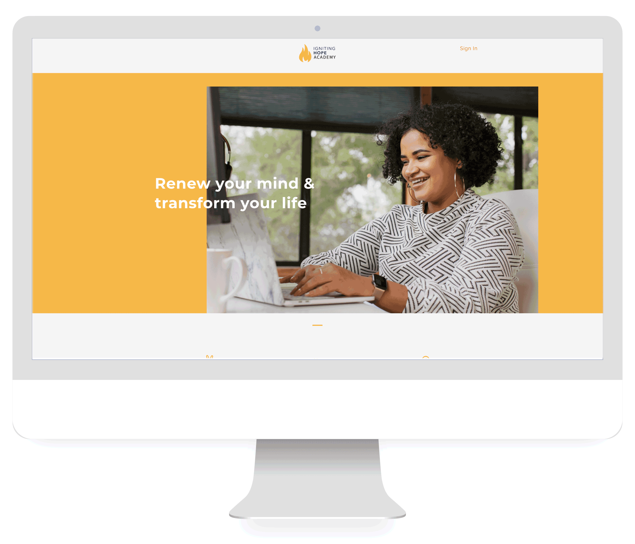
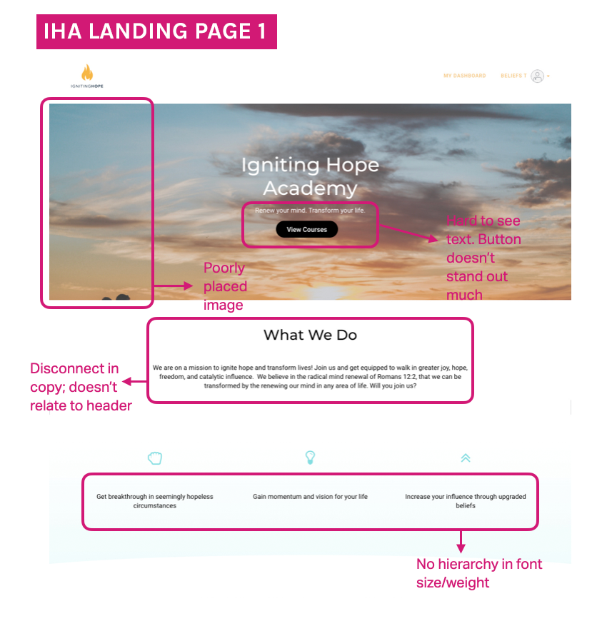
home page
Inspire and inform
I found it crucial to start the landing page with aspirational imagery. What can happen when a user engages in Igniting Hope Academy? Here’s a student smiling wide as she makes progress with class. This satisfaction, pure delight, is a natural outcome of learning here, and an experience anyone can have, too.
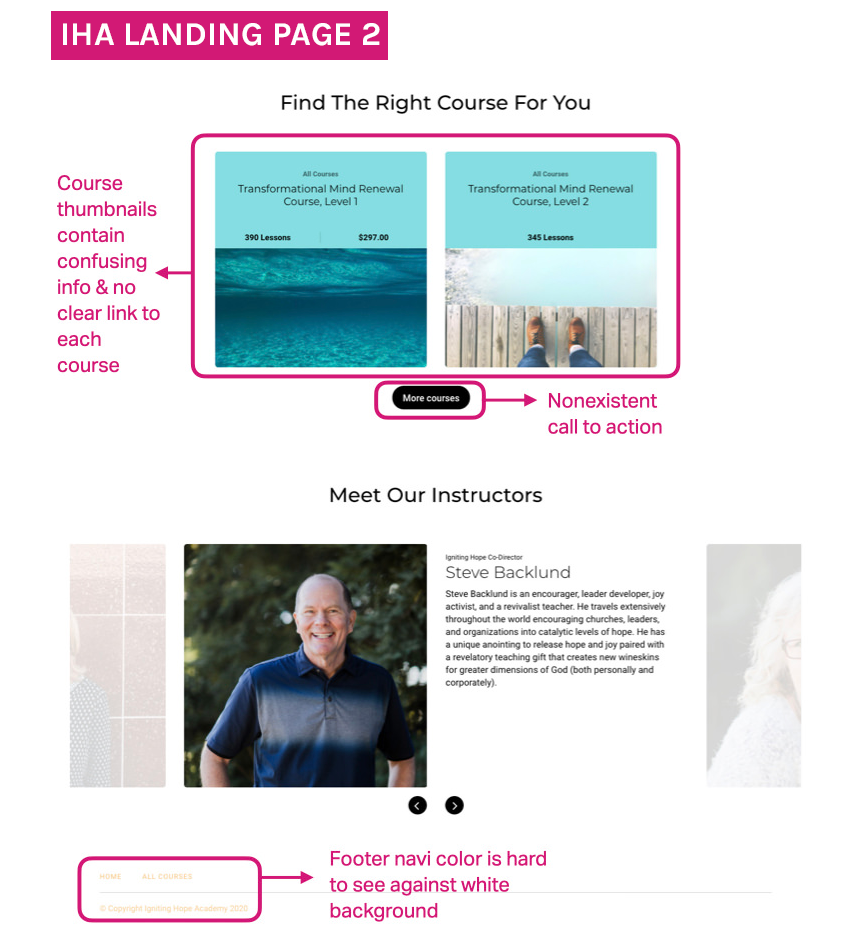
A carousel displays upcoming /ongoing courses users can sign up for. This early and subtle call to action doubles as a selling point and product info.
We then introduce teachers with short and sweet bios, showing whom students will be learning from.
Next, we add credibility with testimonials from real humans who have taken courses.
Finally, the page ends with a clear call to action.
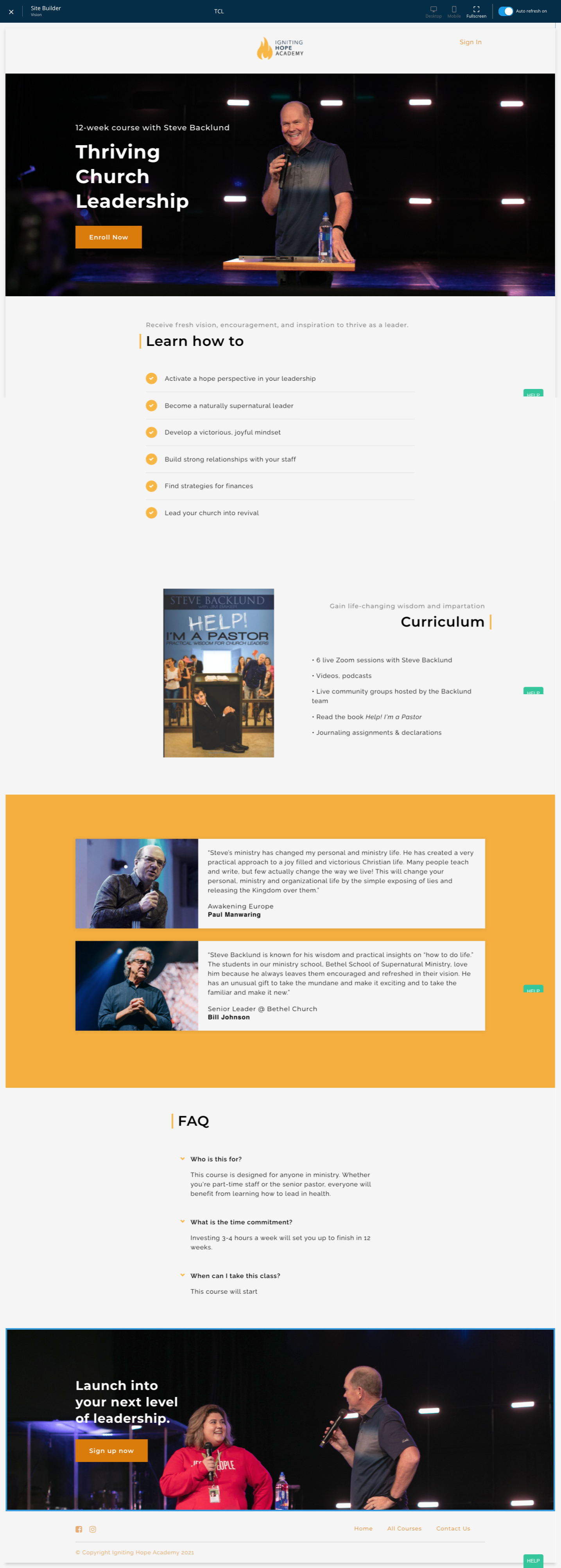
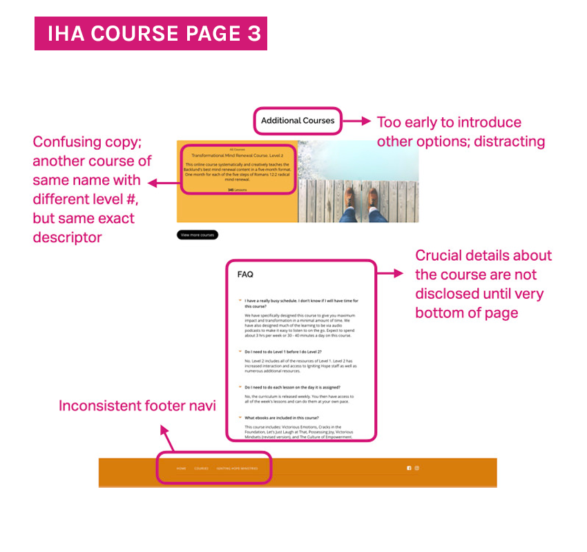
Course pages
Customized but structured
Each class receives its own page, showcasing what makes it worth much more than the tuition with key takeaways.
At first glance, the user can tell crucial details about the course: eligibility, benefits, structure, workload, time(s) and enrollment options.
With simple and direct copy, we minimize the questions that may pop up in a potential student’s mind while checking out the course. Details re: the curriculum, format, and teacher further inform the user.
At the end of the page is the Sign Up Now button, ready to convert browsers into students.

Results
A win-win situation
Since the redesign, over 1,000 students (and counting) have been able to glean from the wealth of wisdom that is Igniting Hope Ministries. Testimonies continue to flood in from students who are deeply impacted.
So far, we’ve developed, filmed, and run 6 courses, taught over 1000 students, and increased revenue by 400%.
This is just the beginning.