Book Design
Victorious Mindsets
12 years later, a second edition
for the bestseller
![]()
for the bestseller
ROLE
cover design
interior design
email copy & design

The original, 2008
THE CHALLENGE
Steve Backlund’s popular book got an internal revamp, calling for a physical makeover to follow suit.
Goal
Victorious Mindsets is about thinking right, because “what we believe is ultimately more important than what we do. The course of our lives is set by our deepest core beliefs.”
The question became clear: how might we visually communicate a winning perspective?
Steve Backlund’s popular book got an internal revamp, calling for a physical makeover to follow suit.
Goal
How might we
design a book cover that emanates powerful thinking?Victorious Mindsets is about thinking right, because “what we believe is ultimately more important than what we do. The course of our lives is set by our deepest core beliefs.”
The question became clear: how might we visually communicate a winning perspective?
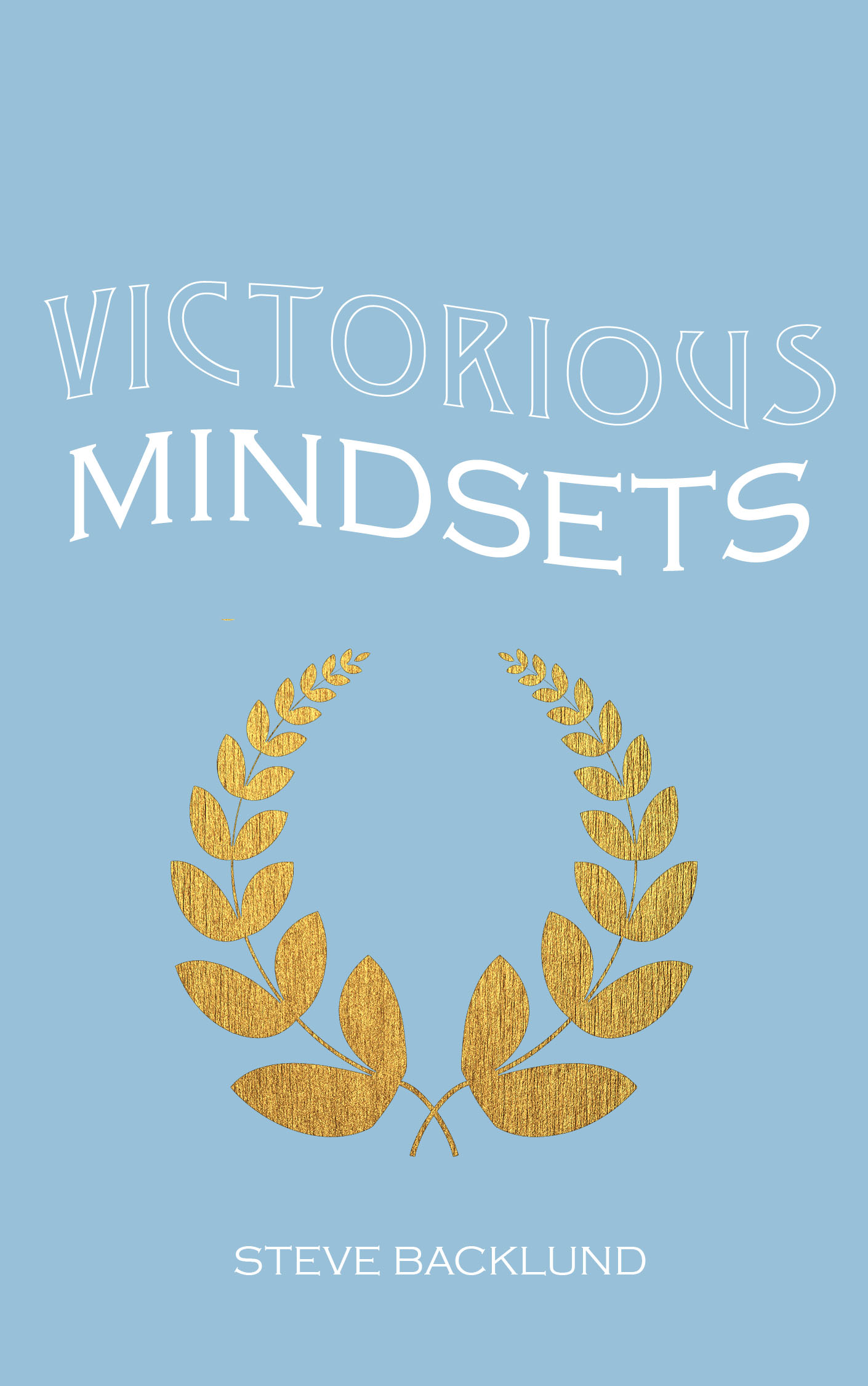
brainstorming
I presented these initial ideas to the author and his staff:
After evaluation and voting, the wreath won.
I presented these initial ideas to the author and his staff:
- mountain imagery
- light breaking through
- alpine glow
- shedding / peeling
- chains breaking
- runner crossing a finish line
- winner’s wreath
- peaceful face resting in a field
After evaluation and voting, the wreath won.
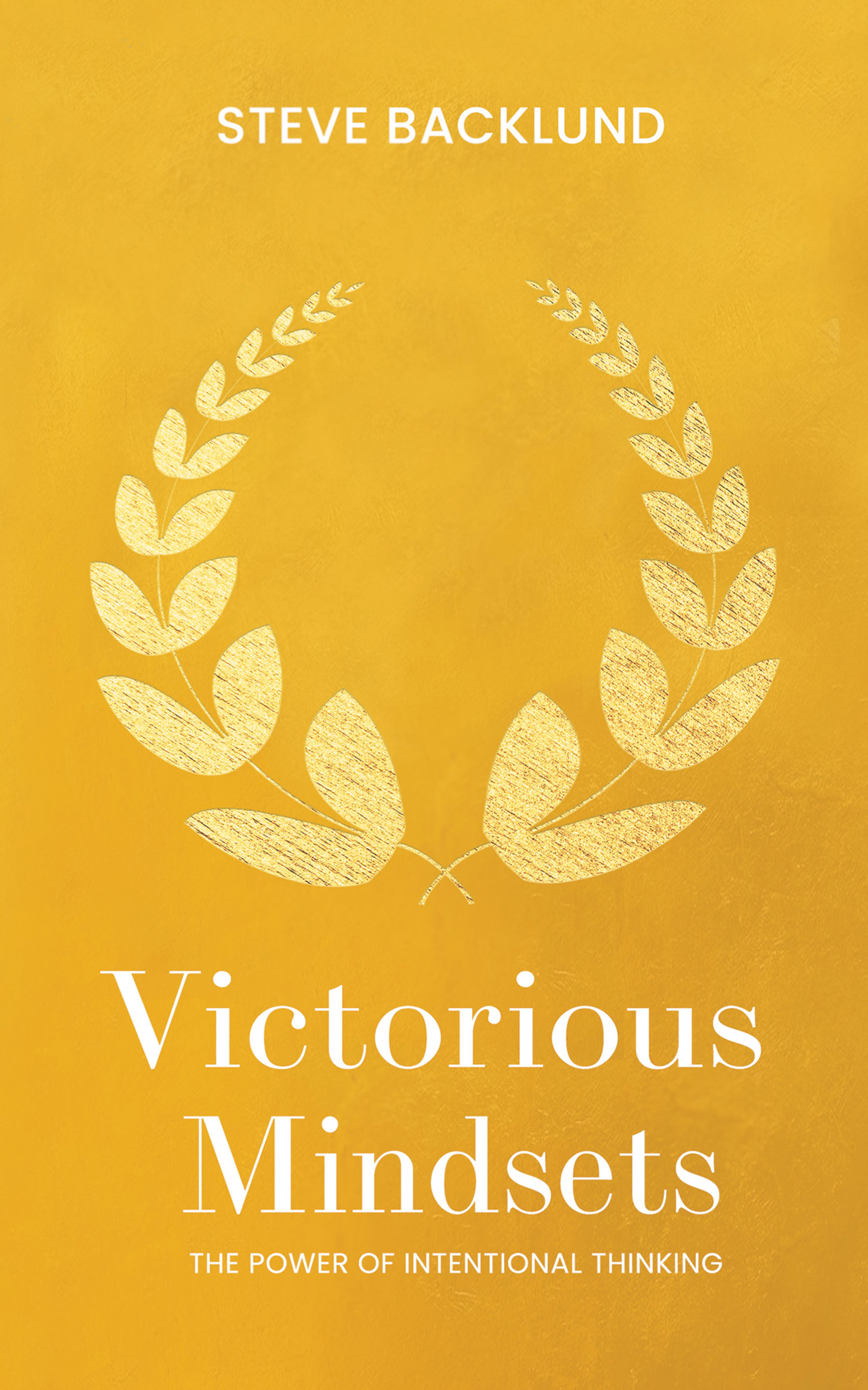
cover Iterations
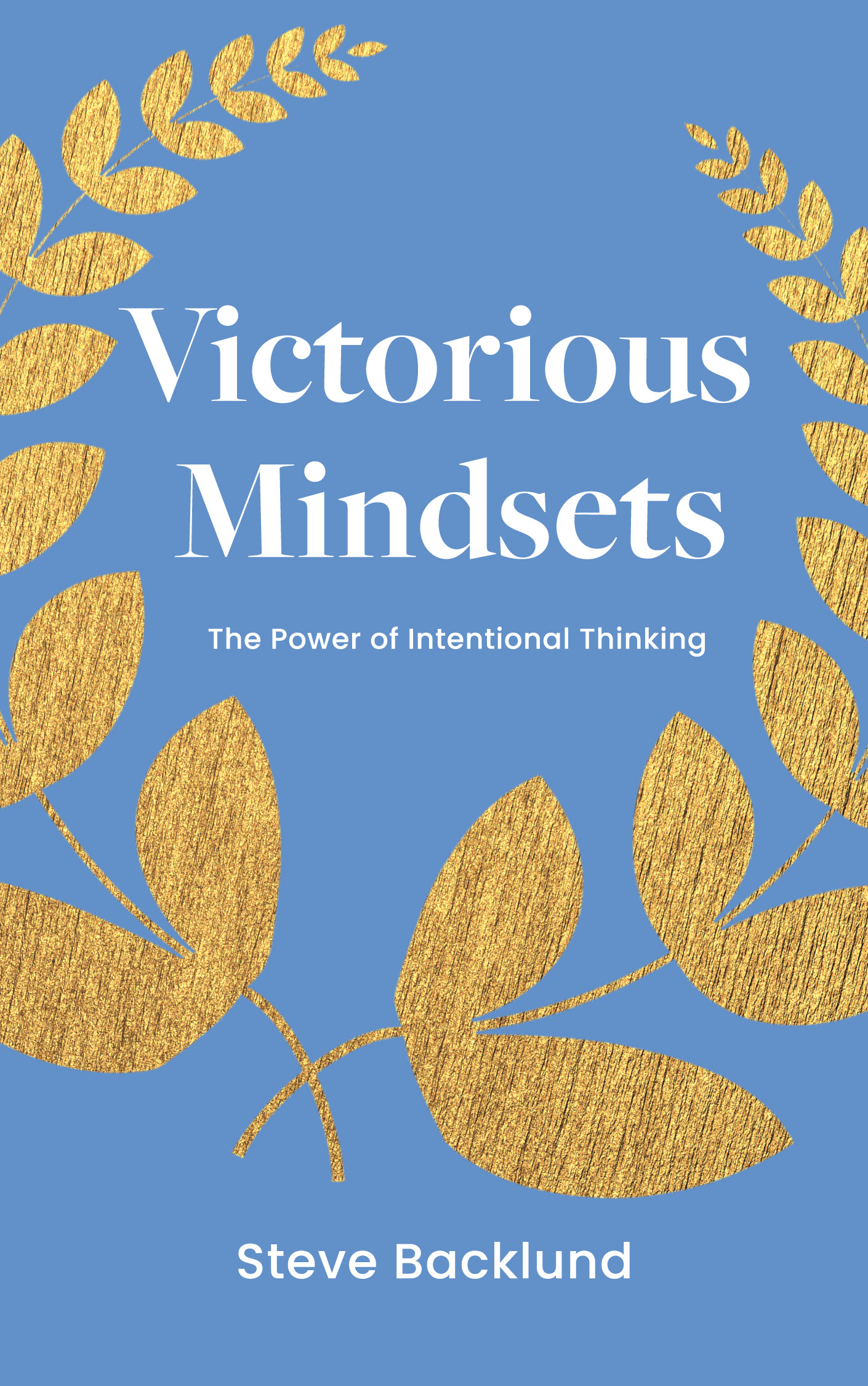
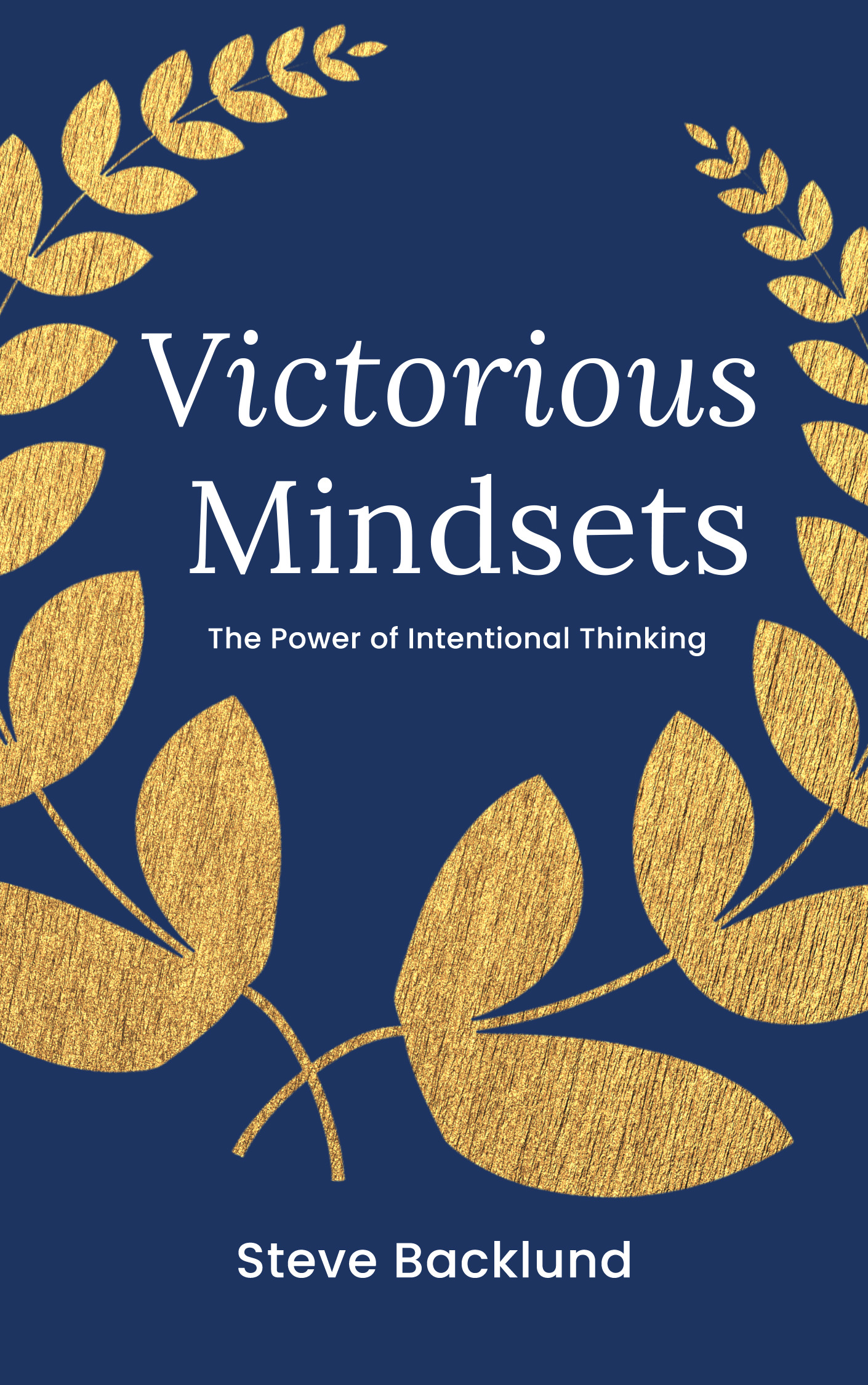


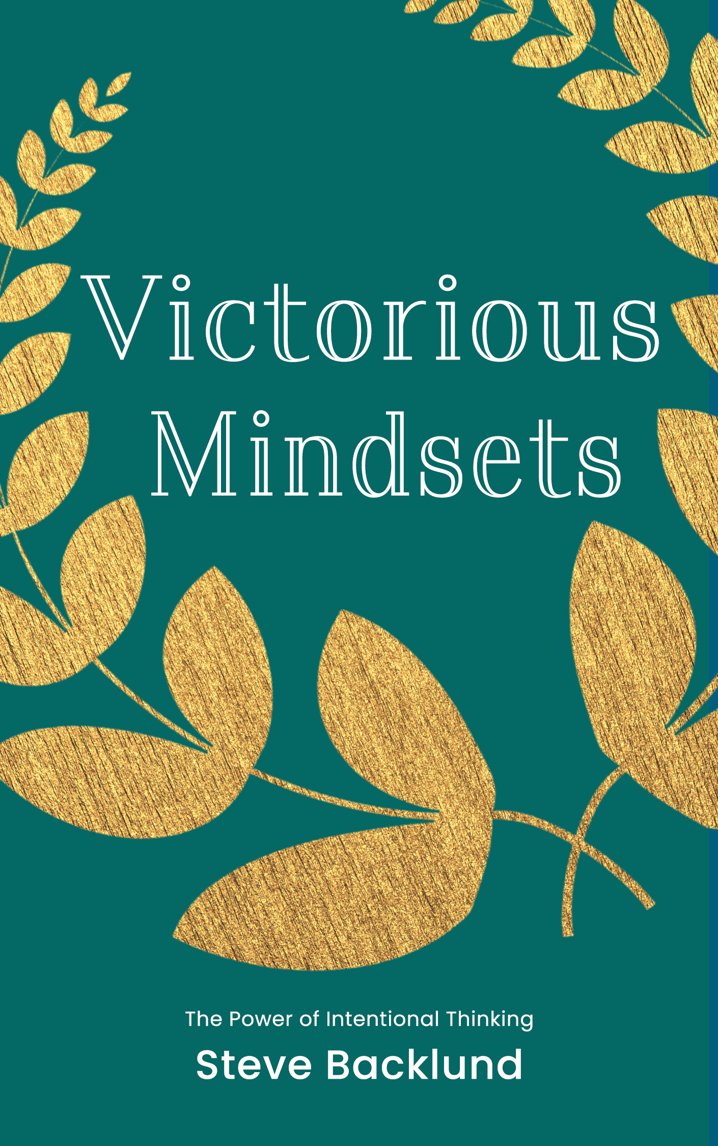
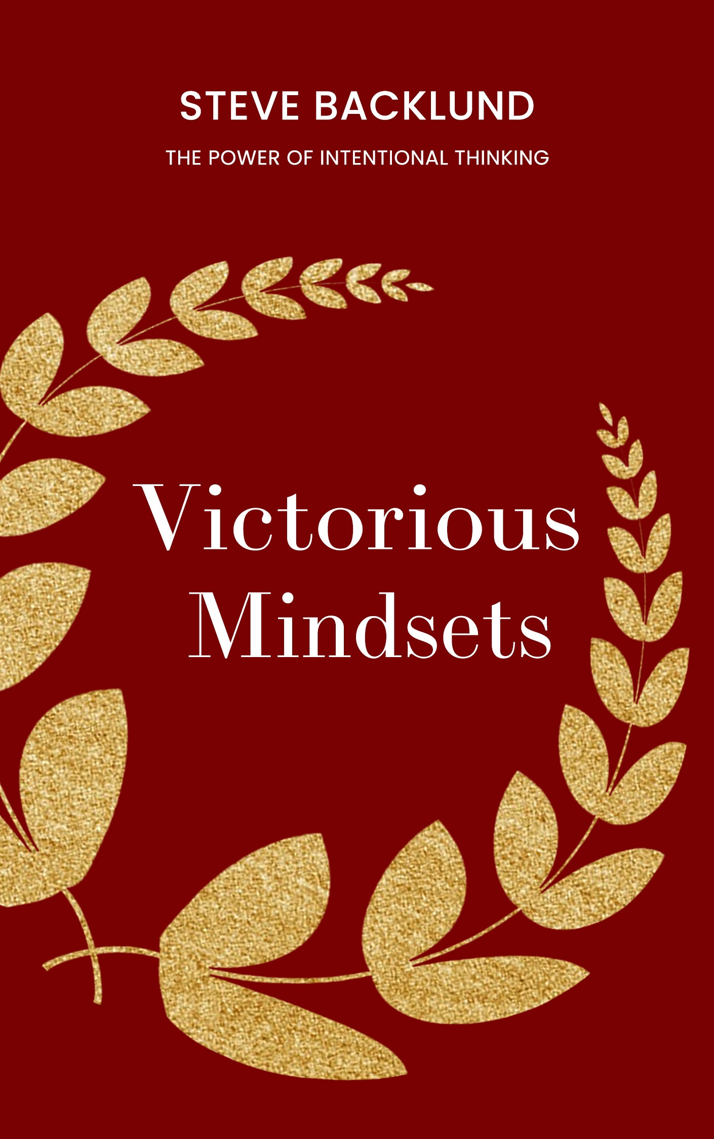
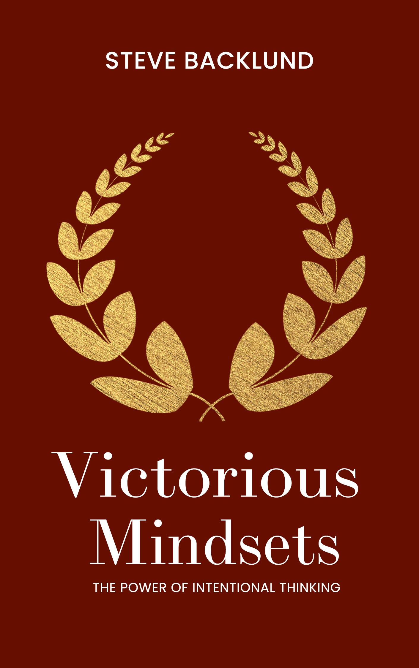

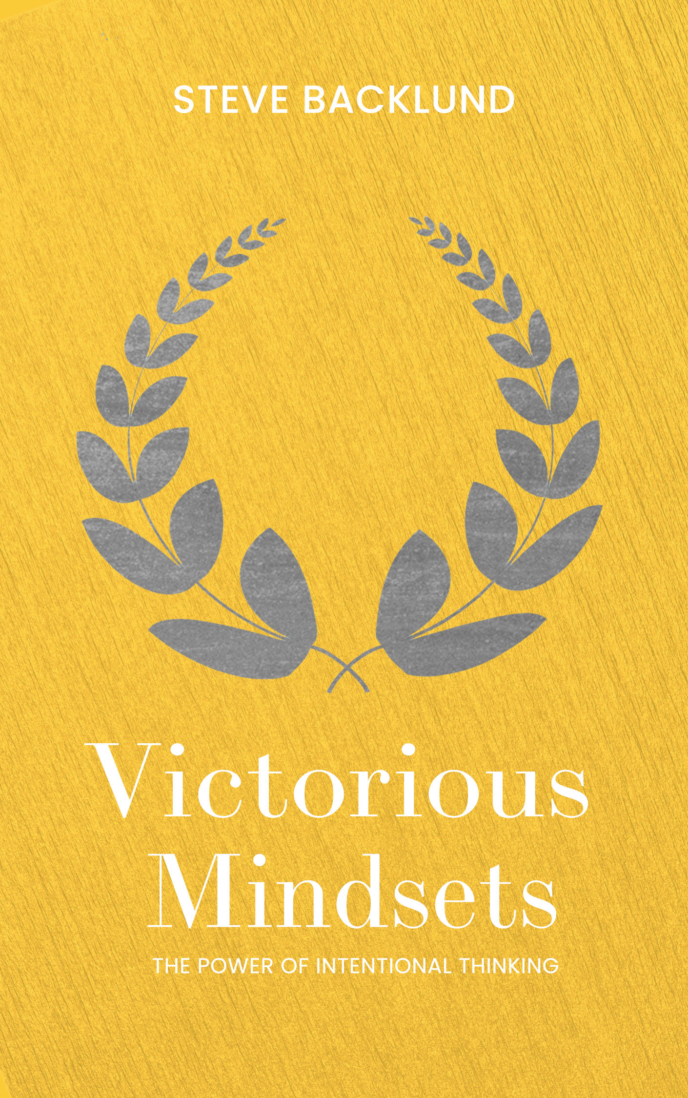

Of the different combinations I explored, Steve’s team fell in love with the yellow on gold action.
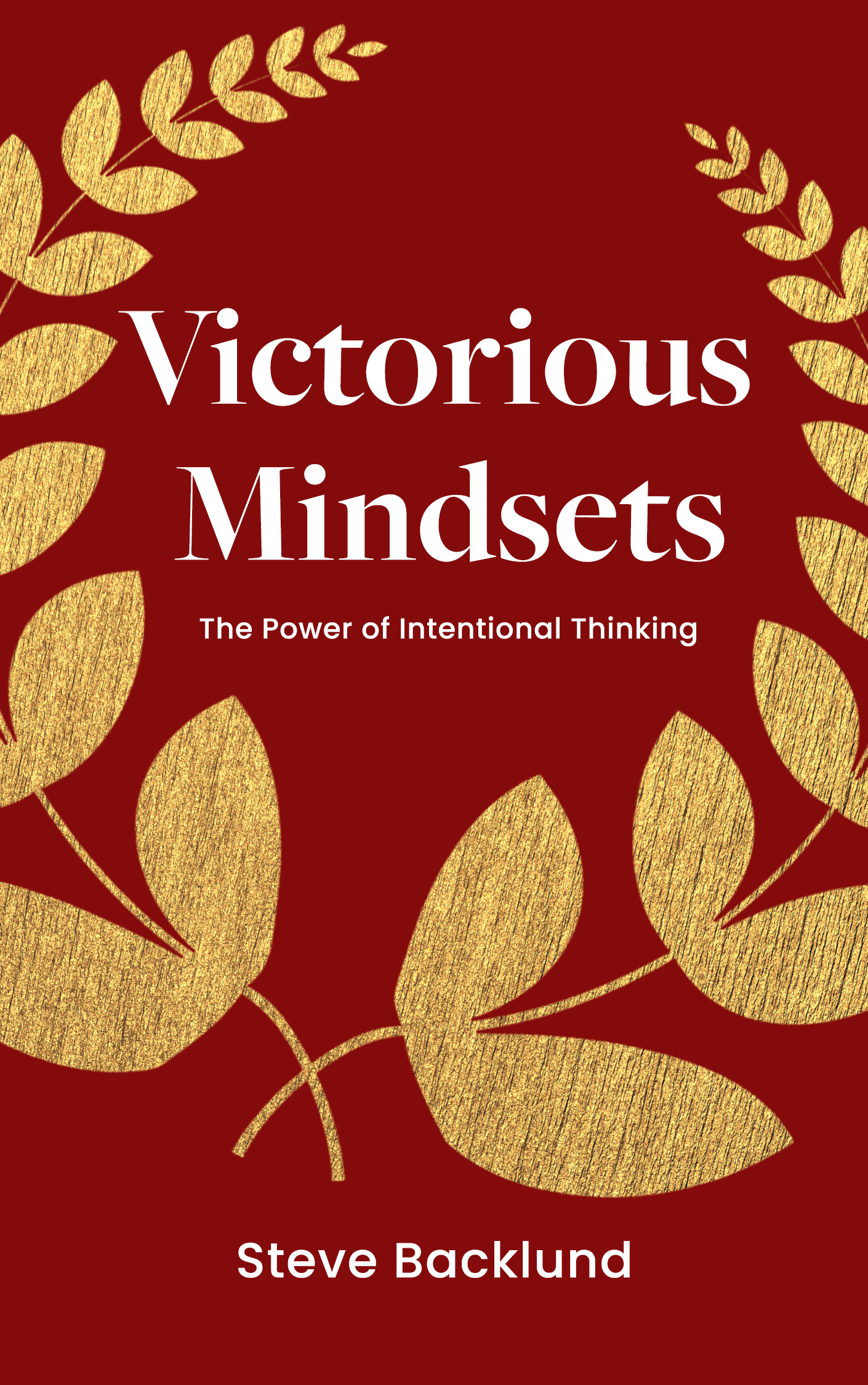
Final cover
![]()
Final cover
brief
For the interior, Steve wanted to appeal to the “non-avid-reader” audience with short chapters.
art direction
Make it easy on the eyes, simple, and modern. Appeal to the casual reader with large font sizes. Employ clear breaks with generous letter spacing and enough white space to boot. Embrace simplicity with sans-serif font faces.

Iconography
The wreath begins on the cover and weaves its way through the book. On every chapter header page, an opaque wreath sits behind the title, and a tiny wreath surrounds the page number in the footer.
Chunky quotation marks emphasize the Bible verse for each chapter.

A “billboard” page doubles as a bookmark and highlighter of the main theme and declaration of each chapter. It separates the written content with bullet-pointed lists to follow.

3 practical nuggets came with each chapter, sectioned off into its own corner.
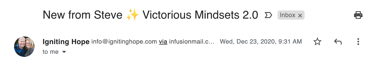
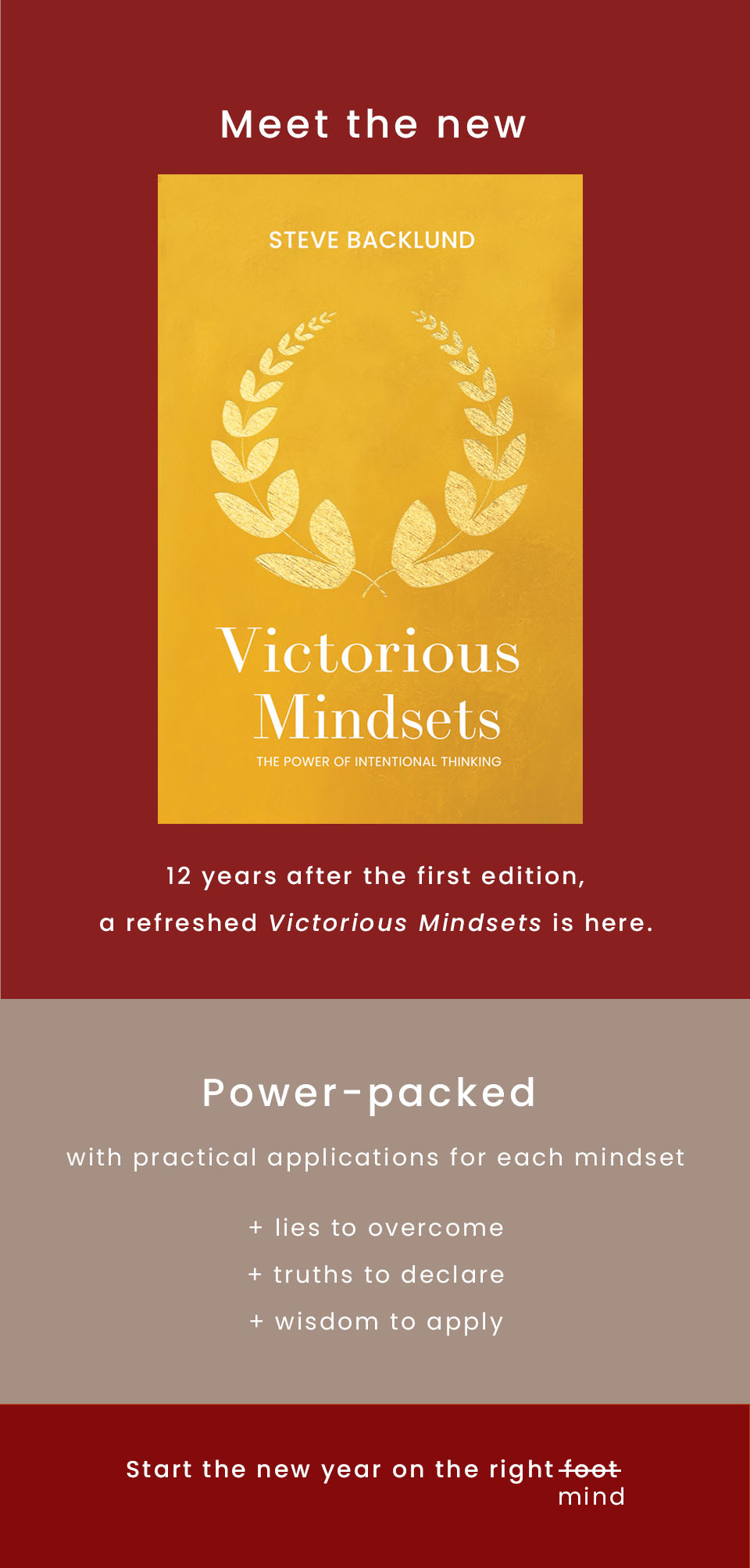
product launch email
I chose similar fonts from the book paired with simple words to announce the book. Unpictured: CTA buttons at the footer of each email.
![]()
Spread the word
The final part of this project presented the new book to Igniting Hope’s newsletter subscribers sent out in 3 different emails.I chose similar fonts from the book paired with simple words to announce the book. Unpictured: CTA buttons at the footer of each email.