content Design
Mind Renewal
In-product copy
transforming out-of-product
experiences
![]()
transforming out-of-product
experiences

My contributions
Content design
user research
ux design
brief
Igniting Hope’s collection of mind renewal teachings didn’t have a place to rest its (proverbial yet profound) head.
Our mission? Create a home-base for all things mind renewal.
Working closely with a PM and engineers, I set out to design *the place* people go to for mind renewal goals.
Igniting Hope’s collection of mind renewal teachings didn’t have a place to rest its (proverbial yet profound) head.
Our mission? Create a home-base for all things mind renewal.
Working closely with a PM and engineers, I set out to design *the place* people go to for mind renewal goals.
user
Excited & eager, our users are ready to learn how to change thought patterns. They’re signing up for mind renewal, but need help to get acquainted with the process.
![]()
research findings
User interviews, surveys, and conversation mining informed us how this product can stand out.
strategy
The copy must maintain the uplifting brand voice of Igniting Hope. Every touchpoint is an opportunity to inspire and motivate.
style & tone
Written words must embody the voice of a
* coach giving a locker room speech
* cheerleader / wingman boosting morale
* “you-got-this” pep talk
Excited & eager, our users are ready to learn how to change thought patterns. They’re signing up for mind renewal, but need help to get acquainted with the process.
research findings
User interviews, surveys, and conversation mining informed us how this product can stand out.
- Make it easy to integrate practices into daily life.
- Provide more accessibility to foundations, principles, and guidelines (pulling up several websites is a hard no).
strategy
The copy must maintain the uplifting brand voice of Igniting Hope. Every touchpoint is an opportunity to inspire and motivate.
style & tone
Written words must embody the voice of a
* coach giving a locker room speech
* cheerleader / wingman boosting morale
* “you-got-this” pep talk
In-app copy
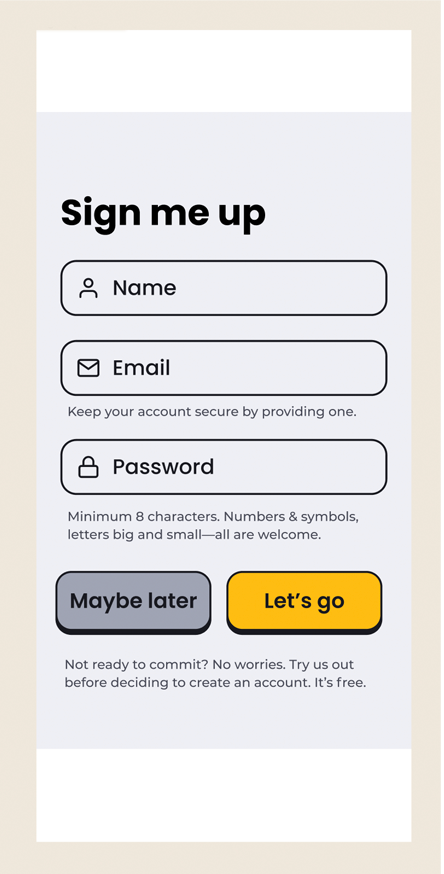
sign up screen
![Before]()
![After]()
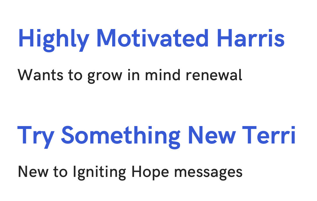
User testing showed this pop culture reference got lost in translation. “I don’t know what ‘beam me up, Scotty’ means. Could be a man named Scott.” –User Who Shall Remain Nameless
Adieu, playfulness. Hello, making sense.
In the final iteration, I trimmed down the word count to make the whole sign up process appear quick and easy.
The result? A round of applause from users in the form of “simple and clear,” “easy to understand,” and “I get how I can skip this page and get to my free trial.”
Iterations
-
“Should you choose to accept this challenge, you won’t be the same again. Do you accept?”
- “You’ll never be the same after this. Should we get you started on a life-altering exercise?”
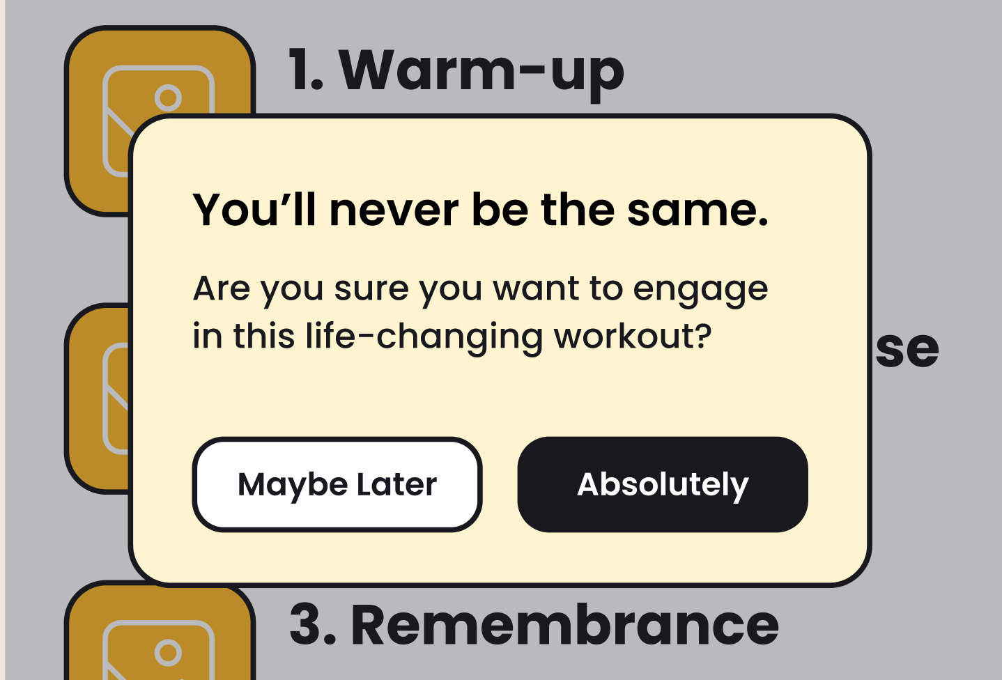
I incorporated Igniting Hope catch phrases (“never be the same”) to invoke familiarity with the brand.
Button text must nudge user toward buy-in for the workout, or let them have space to decline. Never pushy, judgmental, or cold.
PUSH NOTIFICATIONS
What if every notification can impart encouragement? Instead of a reminder to do something, we show up with a quick burst of “you can do it!” energy.
![]()
I also drafted notifications that remind, teach, and ingrain mind renewal practices.
![]()
What if every notification can impart encouragement? Instead of a reminder to do something, we show up with a quick burst of “you can do it!” energy.
I also drafted notifications that remind, teach, and ingrain mind renewal practices.
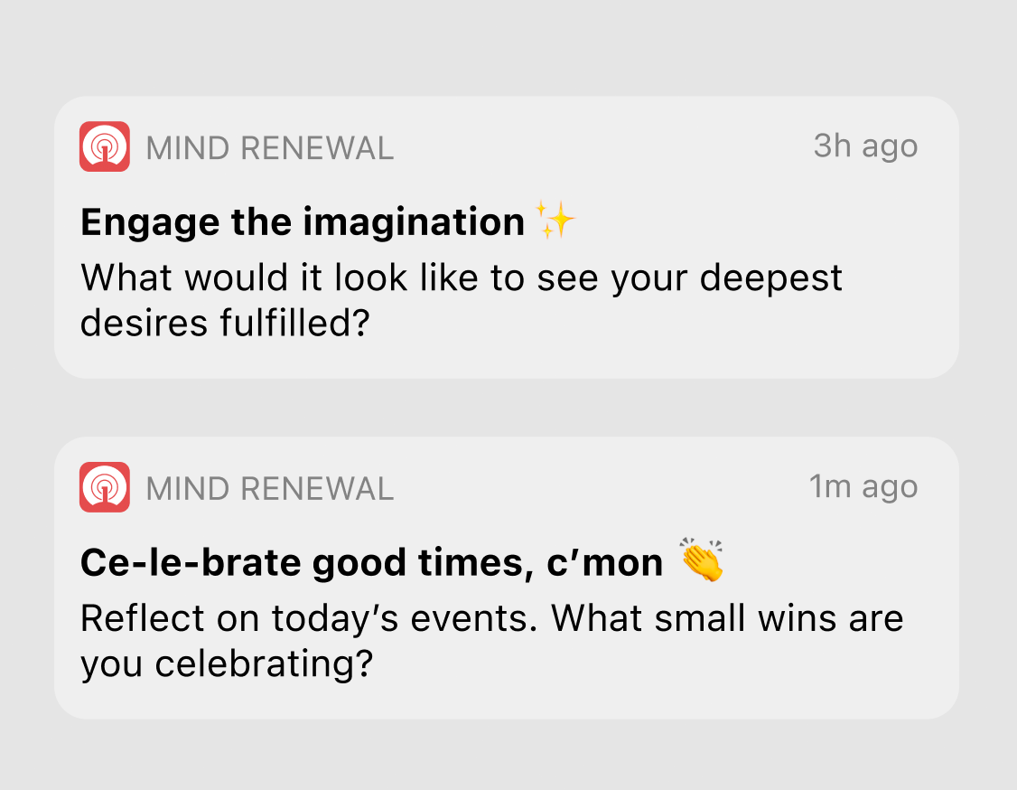
Pop up to lift up.
How might we craft notifications to make our users feel blessed?
In the middle of a busy day of work, family, and juggling multiple responsibilities, the last thing our users need is shame and guilt telling them how little they have worked out.
CTA / ERROR MESSAGE
Straightforward but empathetic, the message is clear: sorry what you want is not available, but we’re here to help you find another option.

Feature Name
Rather than the traditional “reminder” or “alarm” which feel automated, I chose “Remind Me” and “Nudge Me @” to create a sense of closeness to the user.

The more personal the workout plan feels, the greater the sense that it indeed is the user’s. We’re directing with words, pointing users toward ownership: this is not a preset goal you’re partaking in; you have ownership over your plan to renew your mind.
Finishing thoughts
Due to budgeting and business changes, this app did not get to taste life beyond development. If it had made it all the way, I would’ve loved to iterate and re-iterate based on user testing.