product Design
Fall Finder
Spotting autumn colors made easy
Conceptual project
ROLE
USER research
UX DESIGN
UI Design
overview
It’s the most wonderful time of the year. Spectacular colors, crunchy leaf ASMR, sweater weather... hello autumn, we’ve missed you so much.
The only issue? Spotting amazing colors isn’t a piece of cake. Trees don’t exactly put up signs announcing the timeline of their foliage transformation.
Some trees have shed all their hair, while some are still sporting green. Without knowing what’s peaking today, finding fall colors is a gamble.
Enter Fall Finder: an app that takes the risk and headache (+ heartache) out of spotting color. Let’s automate the calculation required to catch fall foliage.
AR mode
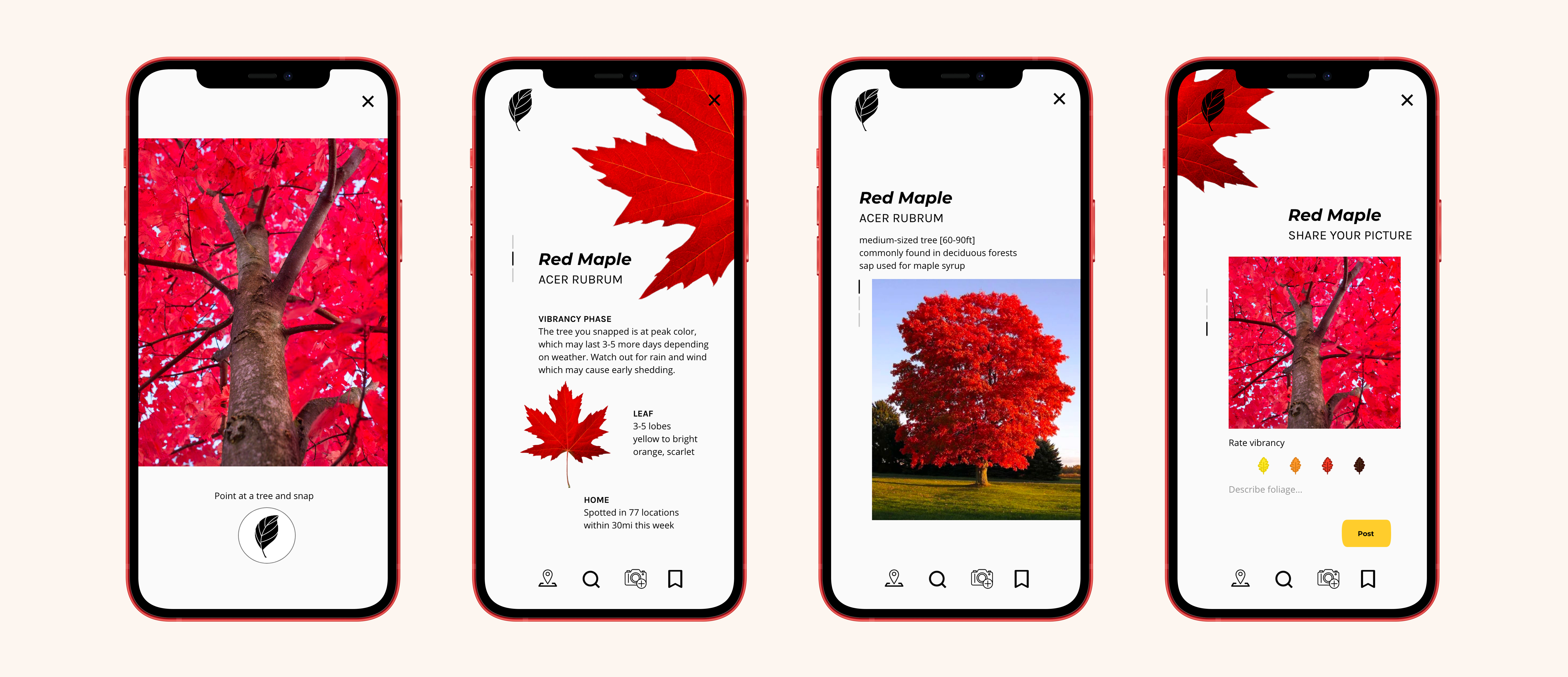
Scan a tree with the AR camera for info, including the vibrancy phase & forecast for said tree.
Users can post their picture to add to the knowledge base.
Scan a tree with the AR camera for info, including the vibrancy phase & forecast for said tree.
Users can post their picture to add to the knowledge base.
post whenever
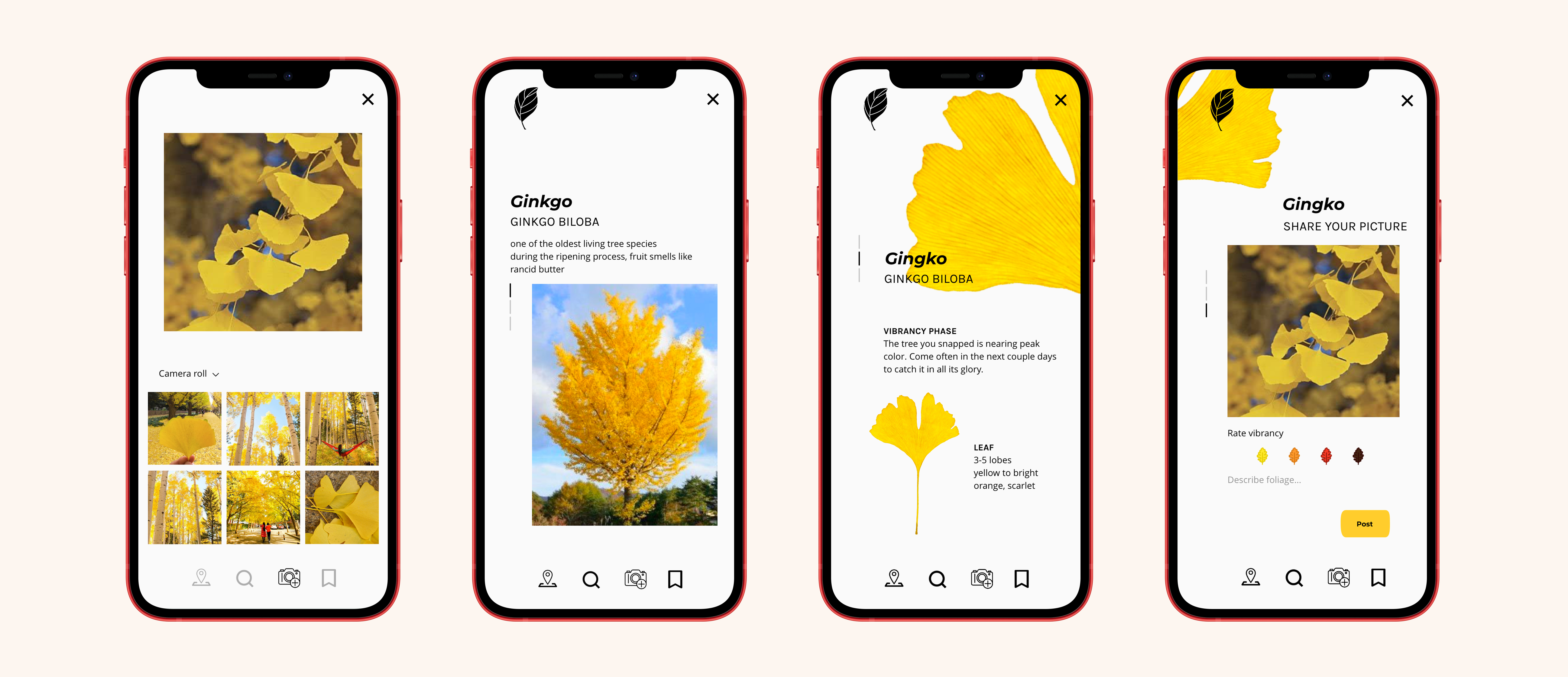
Opt to enjoy the moment. Upload a picture later from the camera roll.
Opt to enjoy the moment. Upload a picture later from the camera roll.

explore
Find spottings near you through map view or the gallery wall.
The explore page invites users to further inspiration with large photos posted by other users. If a picture is worth a thousand words, its appeal is unstoppable.
Clicking on a picture retrieves GPS directions to get to the spot.
Find spottings near you through map view or the gallery wall.
The explore page invites users to further inspiration with large photos posted by other users. If a picture is worth a thousand words, its appeal is unstoppable.
Clicking on a picture retrieves GPS directions to get to the spot.

find
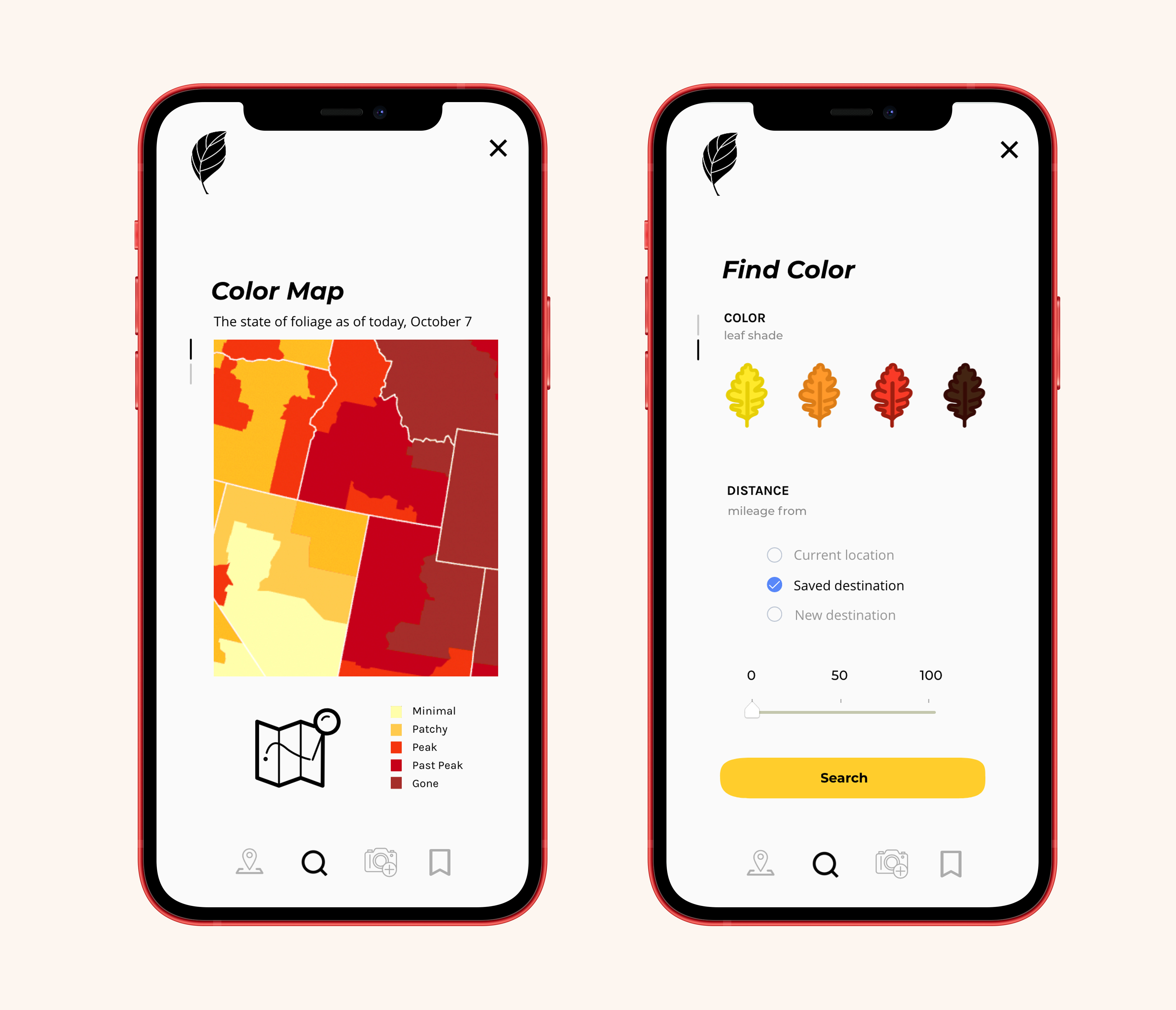
Search by color phase, distance, or region.
Search by color phase, distance, or region.
conceptual PROJECT
primary RESEARCH
I conducted user interviews with fall color seekers to discover their goals, processes, and pain points.
Design Process
primary RESEARCH
I conducted user interviews with fall color seekers to discover their goals, processes, and pain points.
key insights
Reliant on luck
Without research, it falls on catching trees at the right place at the right time, all by happenstance.
Without research, it falls on catching trees at the right place at the right time, all by happenstance.
Tedious and inconvenient
Ways to obtain info abound, but the research process is time-consuming and findings incomplete. Fall seekers must check various platforms i.e. Reddit threads, Facebook groups, tourist sites, and Instagram location tags.
Ways to obtain info abound, but the research process is time-consuming and findings incomplete. Fall seekers must check various platforms i.e. Reddit threads, Facebook groups, tourist sites, and Instagram location tags.
Information underload
Sites that update color news are few and far in between.
Those that do are usually devoted to a county at most for tourist destination marketing.
Sites that update color news are few and far in between.
Those that do are usually devoted to a county at most for tourist destination marketing.
How might we
create a home-base where user-generated foliage data is compiled and updated continually?USER PERSONAS
Through research, one thing became clear: the universality of fall's popularity. Fall is a season that has captured the hearts of people across the board in every possible demographic, from race and ethnicity to socioeconomic, gender, and age.
With that in mind, I set out to design this product inclusively for all kinds of fall lovers. I synthesized findings into 2 personas differentiated by their affinity with tech.
Between the 2 users, we cover all kinds of fall lovers.


COMPETITIVE ANALYSIS
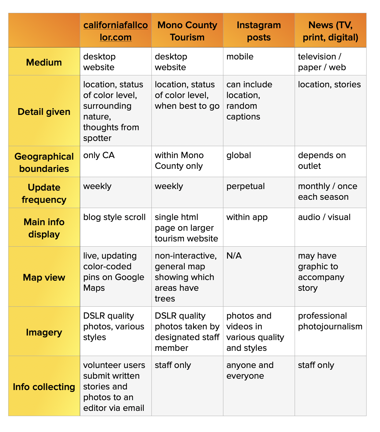
Delving into research methods employed by users, I asked further questions surrounding their experiences.
Delving into research methods employed by users, I asked further questions surrounding their experiences.
insides from outside
Key details hard to find
“I only look at it for inspiration – the pictures are nice. It’s nearly impossible to find the info I’m looking for.”
“I only look at it for inspiration – the pictures are nice. It’s nearly impossible to find the info I’m looking for.”
Lagging behind
“The reports only come out on Fridays, when fall passes in the blink of an eye. I need NOW reports, not last week’s.”
“The reports only come out on Fridays, when fall passes in the blink of an eye. I need NOW reports, not last week’s.”
Hard to navigate
“I don’t always have time to scroll for hours.”
“I don’t always have time to scroll for hours.”
Strength in numbers, but make it easy
How might we keep users updated on ever-changing color phases?
What’s blooming and where are colors peaking today?
Fall hunters do one of two things: 1. drive around and hope for the best or 2. rely on info from other people.
#1 comes with a side of time consumption plus a low success rate. #2 provides advantageous headstarts but is unfortunately difficult to acquire.
The solution? Word of mouth AKA humans helping humans. Make #2 easy peasy.
This is where community comes into play. Fall friends, unite!
See something, say something. Passing on info never felt so fulfilling. Enjoy a sight, post about it, and let your fellow fall lovers frolick in dreamland.
FEATURE PRIORITIZATION
I chose to build an app instead of a website because user research showed fall lovers need to have accessible info on-the-go and map their route to the next destination.
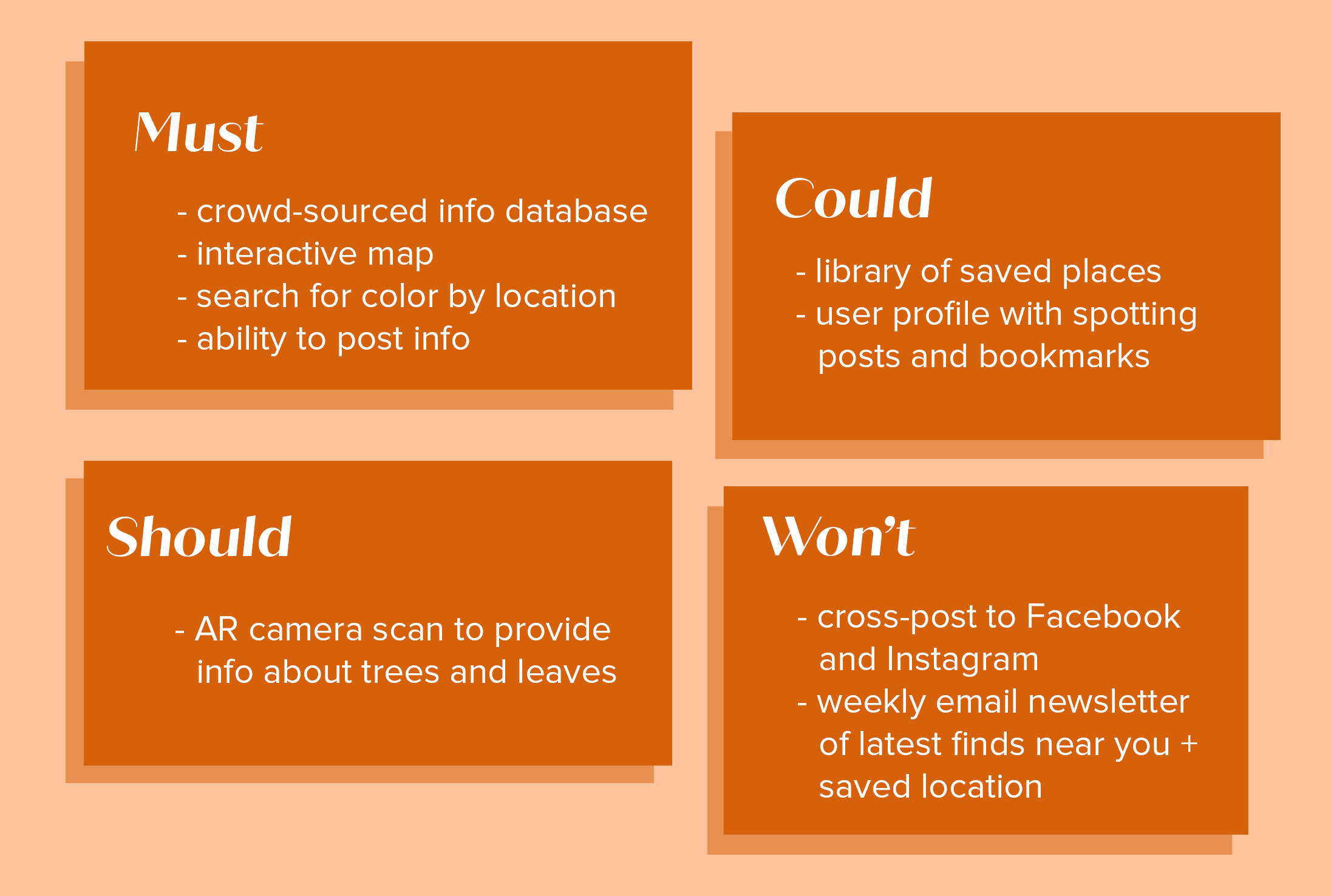
Of the many things this app could be, I sorted feature ideation with a MSCoW chart.
I chose to build an app instead of a website because user research showed fall lovers need to have accessible info on-the-go and map their route to the next destination.
Of the many things this app could be, I sorted feature ideation with a MSCoW chart.
WIREFRAMES
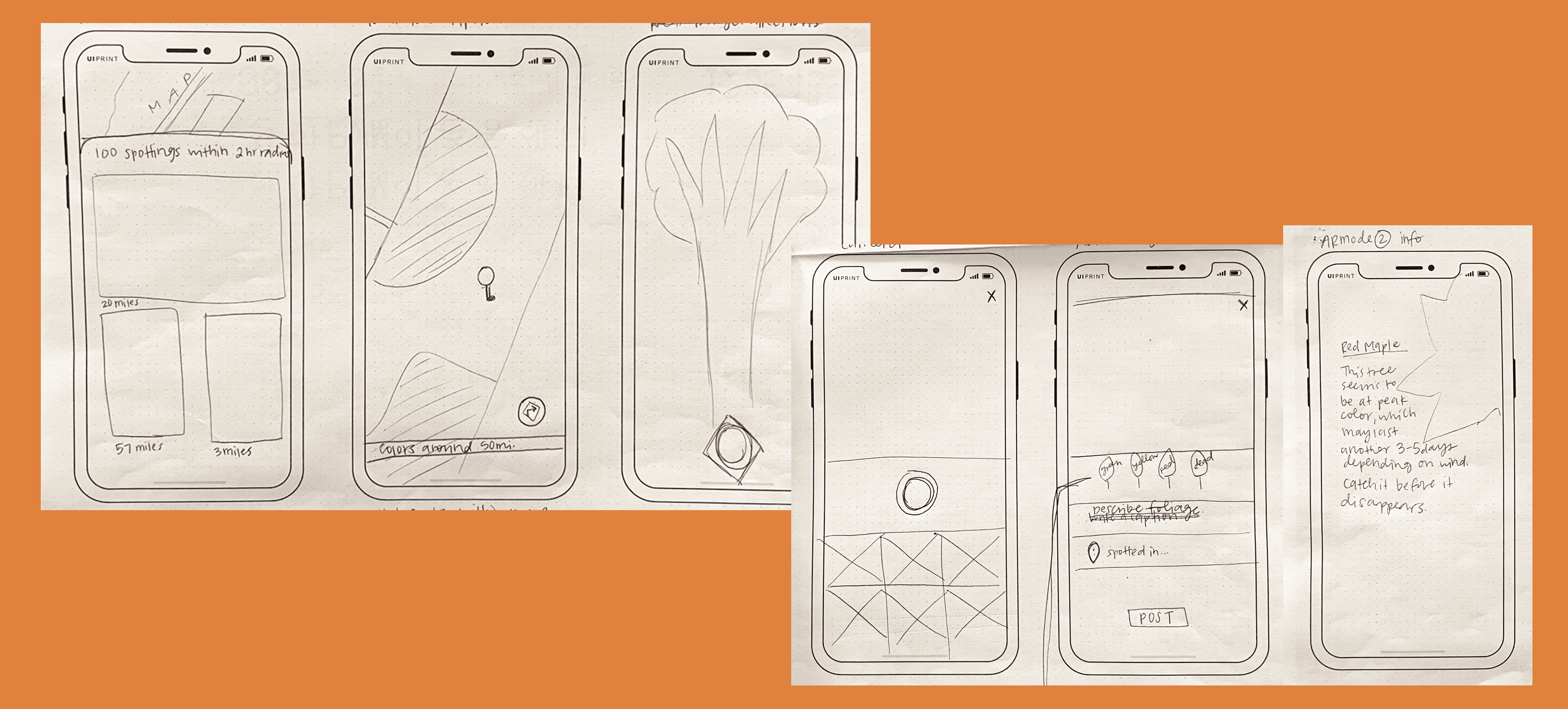
Lo-fi sketches paved the way for iterating screens.
strategy
art direction
Spot, soak it in, share
art direction
- Simplify everything for the Autumnal Anthonies - easy to read, navigate, and post. Aim for sophisticated but unintimidating.
- Communicate with large visuals - fall seekers are motivated by aesthetics.
- Colorful as fall: this is an app about color, after all. Make things pop with autumnal hues.
Next steps
This app was constructed during the spring, but I'd love to test the prototype in real time throughout fall.Ideas for future iterations
- personal library / manage your bookmarked places
- push notifications of color changes & new spots near you
- build community: comment on posts & message users
- curate great posts and reward users with “best photos of the week” contests
- Near Me page: search bar with filters i.e. days since posting, specific location
- off-line ability to see map
- database of kinds of trees per region
- explore how this fall-focused app can remain relevant through the remaining 3 seasons of the year